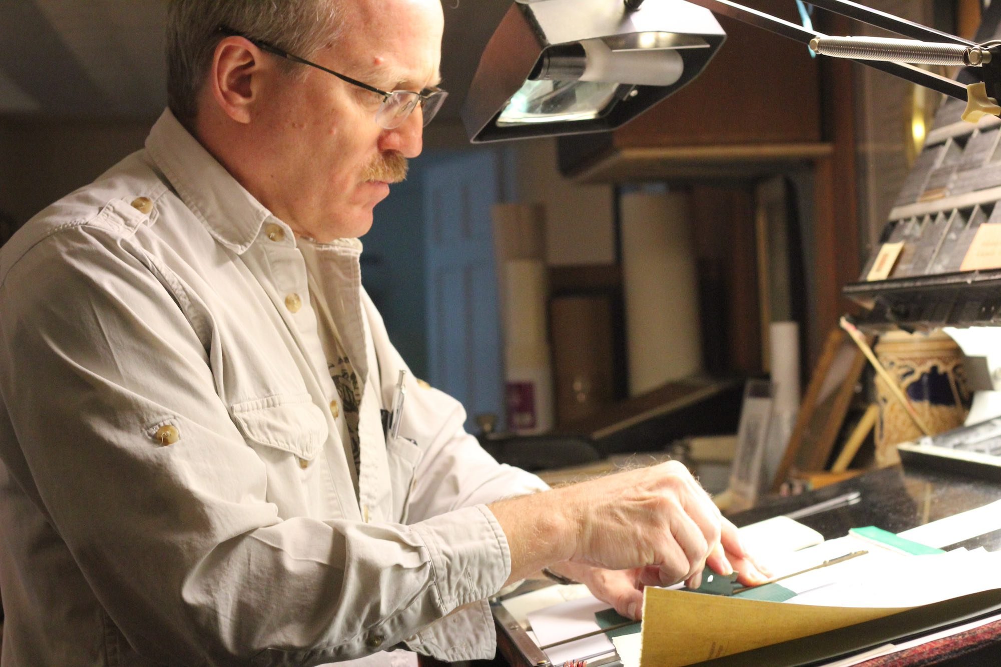
Letterpress Gallery
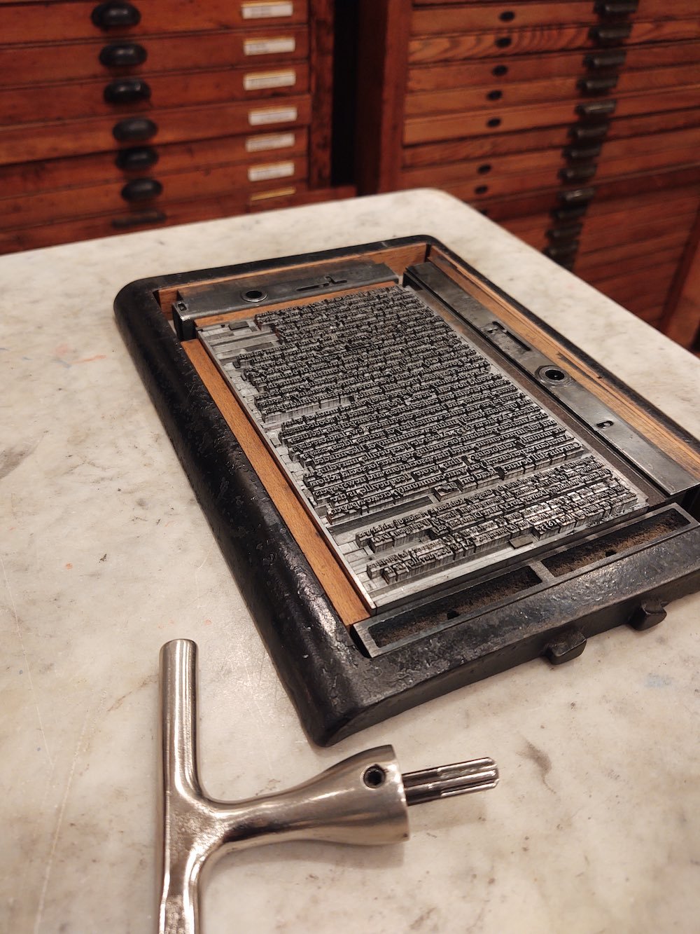
The "form" (lines of type together in a block) locked in the "chase" (the iron frame) with "furniture" (iron and wood blocks) held in place by "quoins" (whose "key" is visible in the foreground), all resting on the (composing) "stone."

My first press (a 5x8 Model P Kelsey), in Seattle, 1962. My father added a wooden extension on the cast iron lever to make it easier for a boy to use! (I also needed to stand on a wooden step.)


Running the Chandler and Price (1889 job press) around 1972 in Seattle. This was said to have been the first press of Craftsman-Metropolitan Press, the largest printing company in the Pacific Northwest at the time, where my father worked. He bought it for $150. For a while I called our private operation the "Sea Turtle Press" because, except for the "ur," it spells "Seattle." And what is "origin" of "ur," I ask you.

A 5x7 inch card from an edition for fellow members of the Chesapeake Chapter of the American Printing History Association, in which we were to set a piece in our "house face" (for me, 14 pt Centaur and the companion italic, Arrighi); tell the story of our press; and include an ampersand (can you find it?). I managed to get in some Arabic, Latin, and French along with the English.
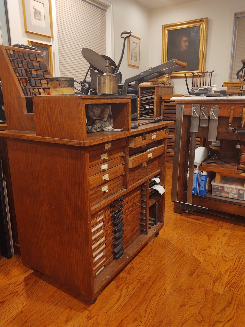
Partial view of my current studio ("print shop"). Notice the 1962 Kelsey with the extension on the lever. The press cabinet was made by my father in 1985 and sent to me in Jerusalem.
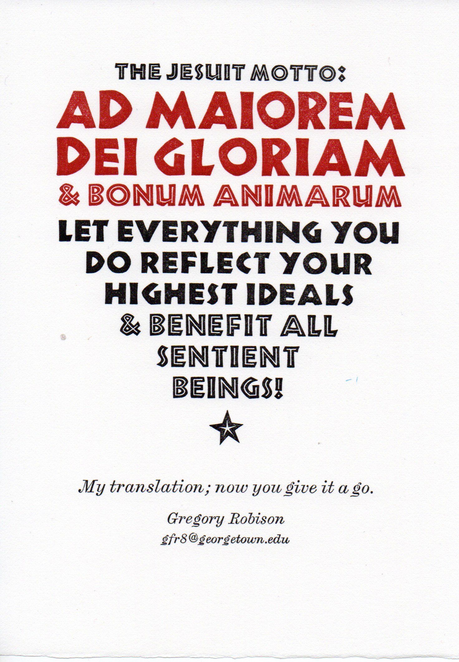
I ask my students at Georgetown to look around at the "hortative banners" that festoon the campus and try translating them, usually from English into more meaningful English, or at least into an equivalent saying that makes sense to them. But some of the banners are not in English, like this commonly seen Jesuit motto in Latin. I gave it a somewhat Zen twist in my translation and shaped the composition into a heart (with a blood-red ventricle at the top!)
A late 19th century Doughaday table-top press, in my studio. "I Ink, therefore I am" poster from the local chapter of the American Printing History Association on the wall.
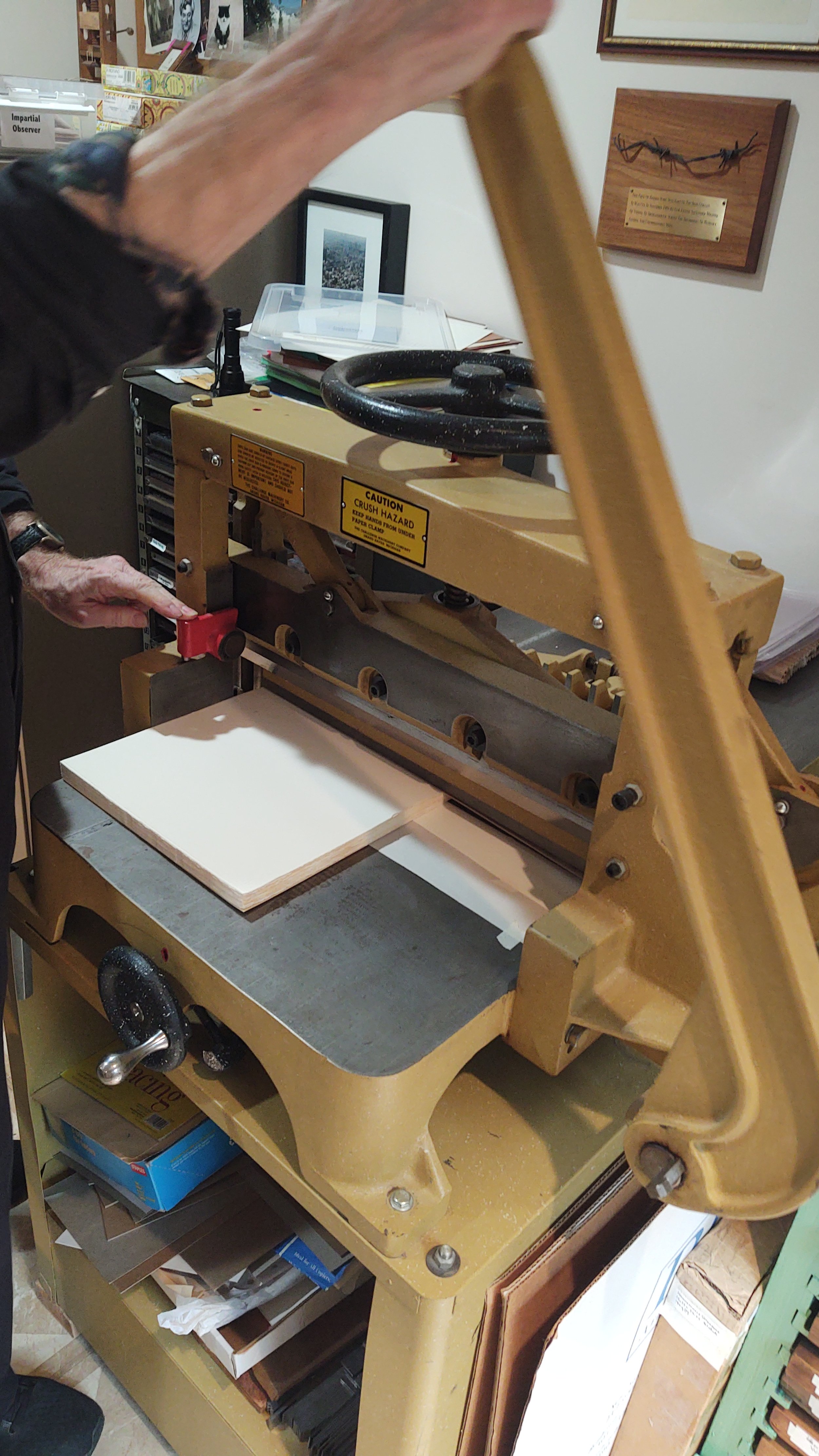
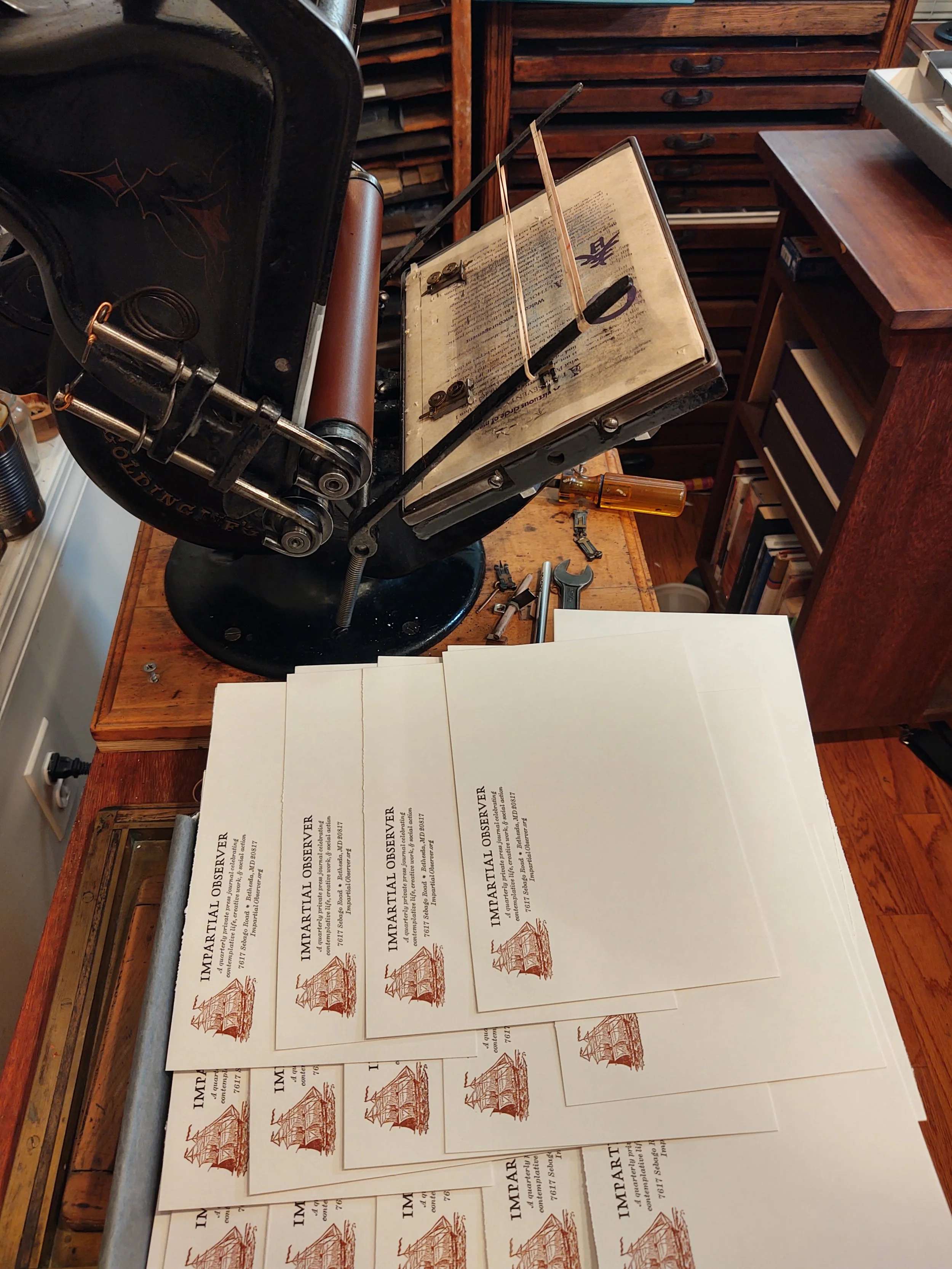
Before printing the Impartial Observer, the stock is trimmed down to the right size, leaving a margin for the grippers on the press. ("Stock" is the printers' term for "paper" before it's printed.)
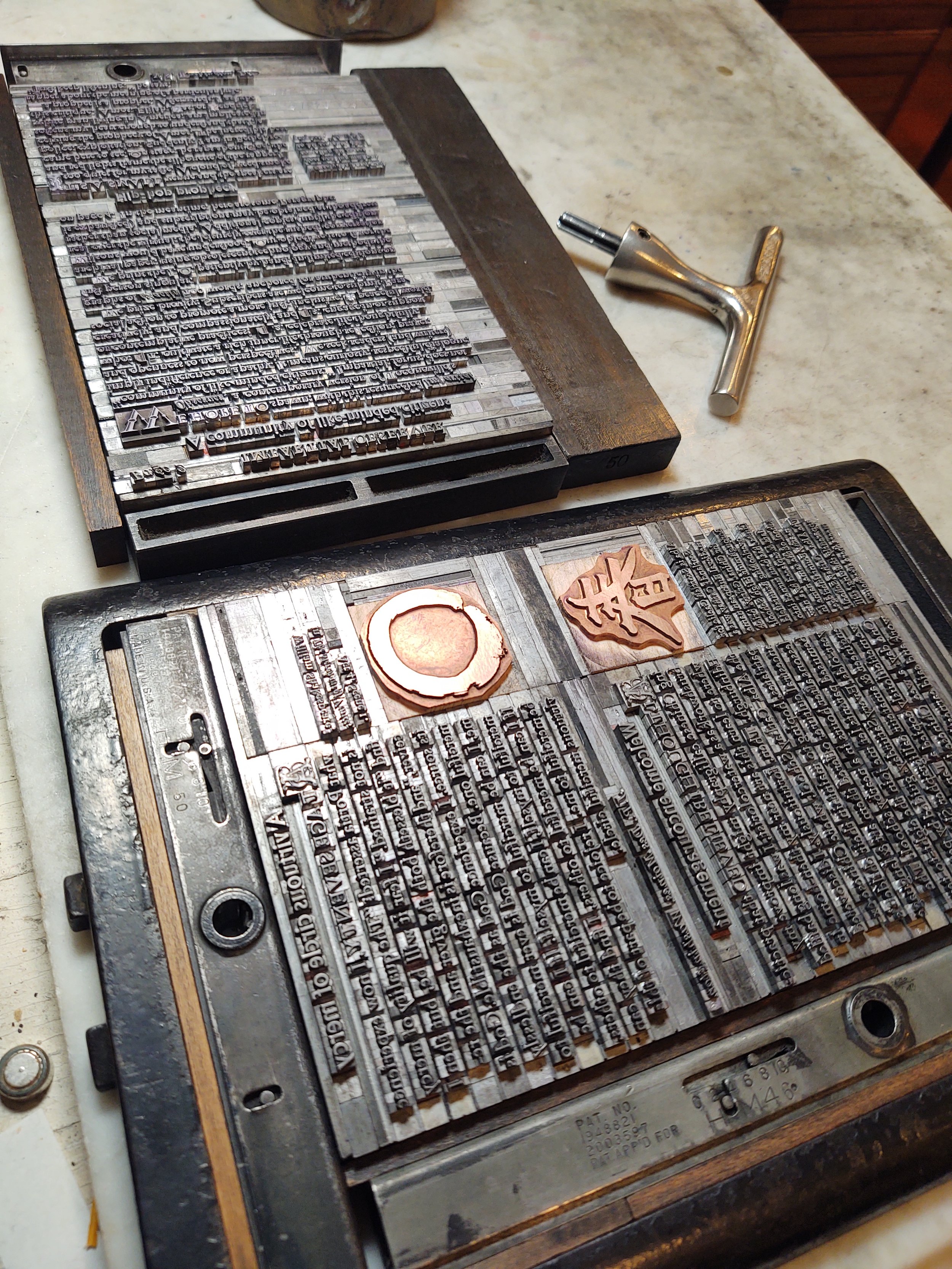
Anything that is not alphabetic is supplied by copper engravings, in this case a Zen enso and the Chinese character 'chun': spring. These are on page 3 of the Vol I No 1 of the Impartial Observer.
The copper cut of the 18th century bark is printed on the ca. 1875 Golding Official.

I am so mesmerized by this gorgeous German blackletter type face (Wilhelm Klingspor Schrift) designed by Rudolf Koch a hundred years ago that I seek out appropriate ways to use it. I have it only in 36 pt. The red "J" is a Dutch Initial from around 1900 by an unknown designer. Koch produced perfectly fine capitals in WKS (in both narrow and wide format — very unusual) but I decided to go a little Victorian. Must have lost my head! I have always loved the sentiment in this fragment by German Romantic poet Novalis.
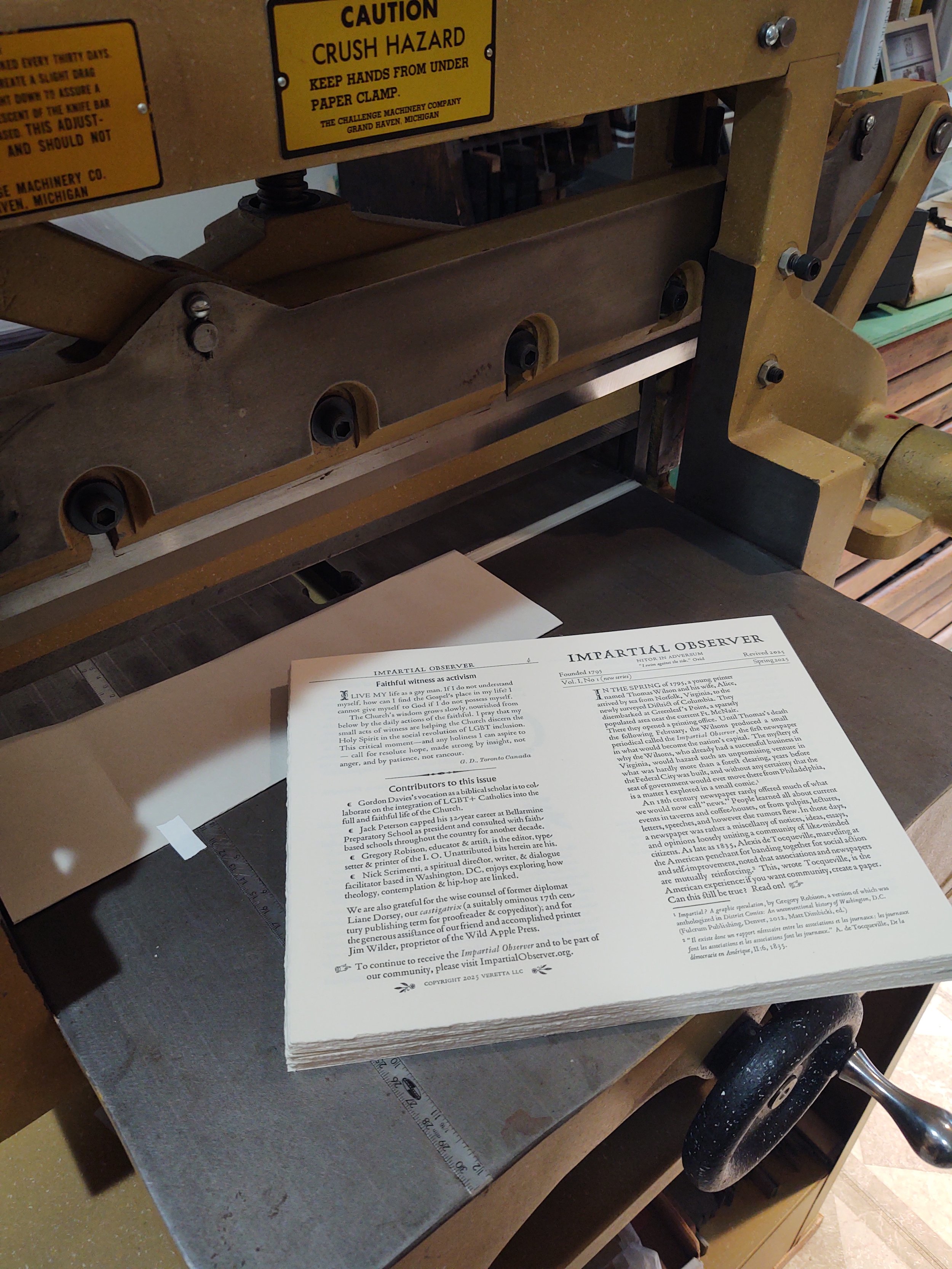
Now the printed copy of the Impartial Observer is ready for trimming. ("Copy" is the printers' term for "paper" after it's printed.)

I have a trove of XIX century wood type of various designs, originally meant for posters. This 4-1/2x5-3/4 inch card also features a similarly old copper engraving of a full-rigged ship. Although I used this as a postcard, you could slap it on the side of carton if you're moving house.

I like to do short pieces in foreign languages, with or without translation, usually with some connection to a contemporary event or interest of mine. I composed and printed this one in reaction to a crisis of a few years ago (that's how printers react to events), but since there's always a crisis coming around, it's always a propos. My father knew the author, French aviator and author Antoine de Saint-Exupéry, around the time when St.-Ex wrote this shortly before died, so it has additional private meaning for me. Typographically, my problem was that this font, Rudolf Koch's Neuland, doesn't include French accents. So I had to add the accents by pen. The Heinkel bombers in attack formation (the crisis St.-Ex was thinking about) are rendered in a linoleum block cut.
Letterpress is great for small, personalized pieces that can be mailed through the postal service. This address side of a note card includes a lino cut of a Ugandan crested crane. I drew and printed this while we were living (with my press!) in Kampala, and includes a whimsical XIX century typeface called Crayonnette.
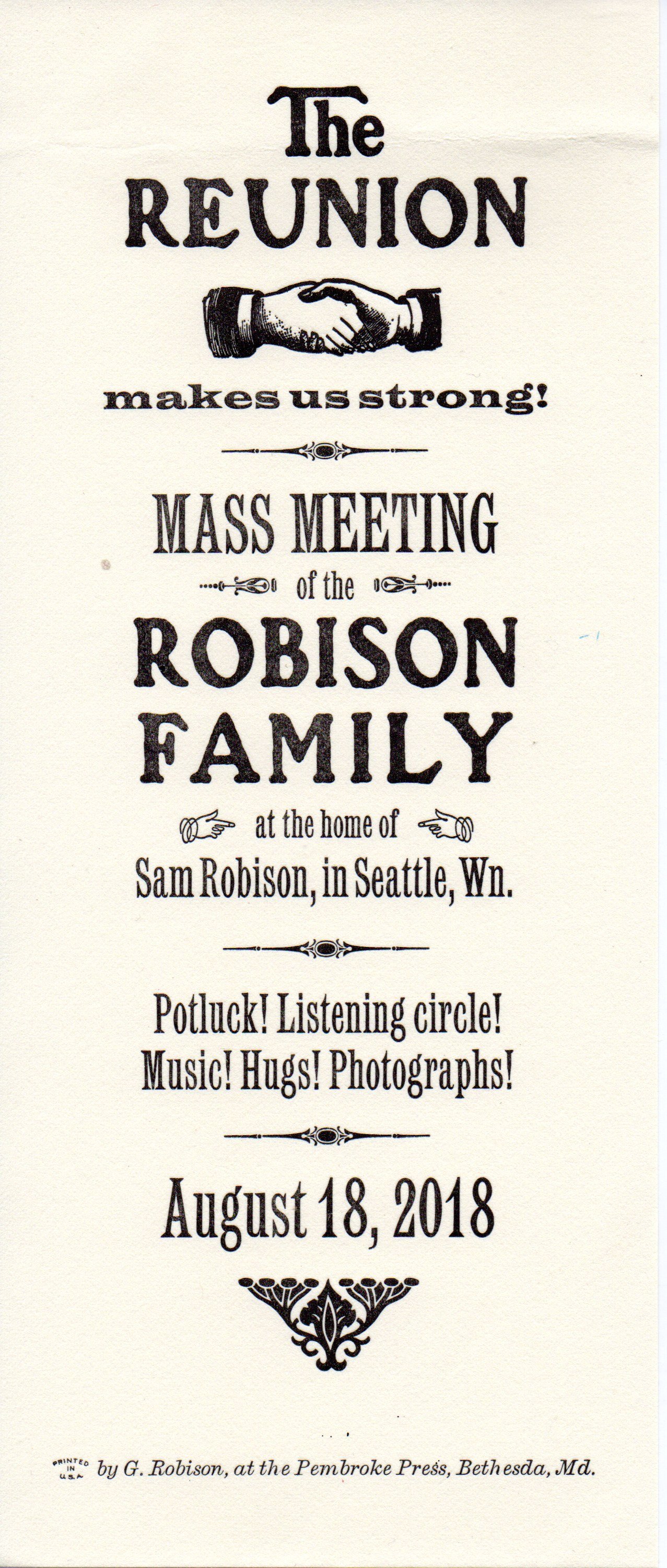
Letterpress is appropriate for keepsakes of events of any kind, at least to the extent that people care about anything printed on paper. I made this for a family reunion, using the type and press of my friend Roland Hoover. It's supposed to suggest an early union organizing poster, although the final piece is only 4-1/4 x 10 inches.
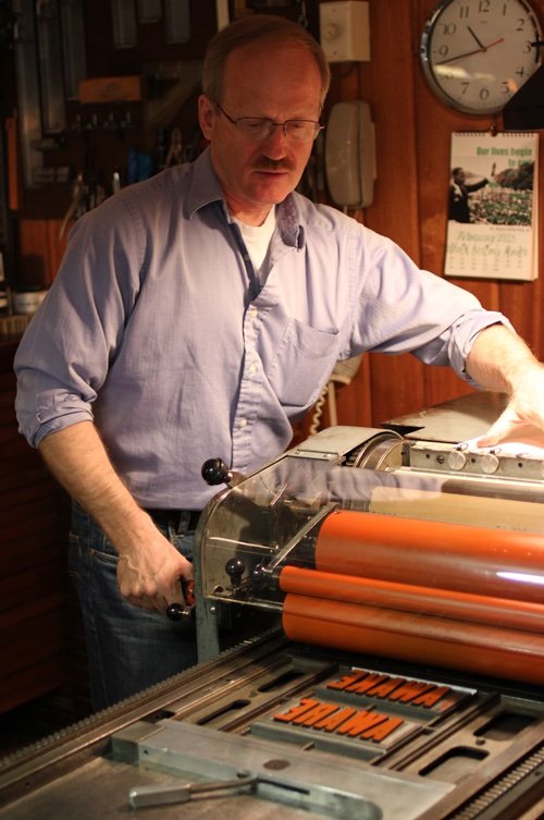
Sometimes, when I have to print something larger than my own presses can handle, I enjoy the hospitality of friends who are also letterpress printers, and use their equipment. Here I am at Roland Hoover's Vandercook Universal One a few years ago.

This 8-1/2 x 11 inch poster required four passes through the press, once for each color. I meant for the ampersand to link the composition, allowing it to be read from top to bottom as well as left to right.
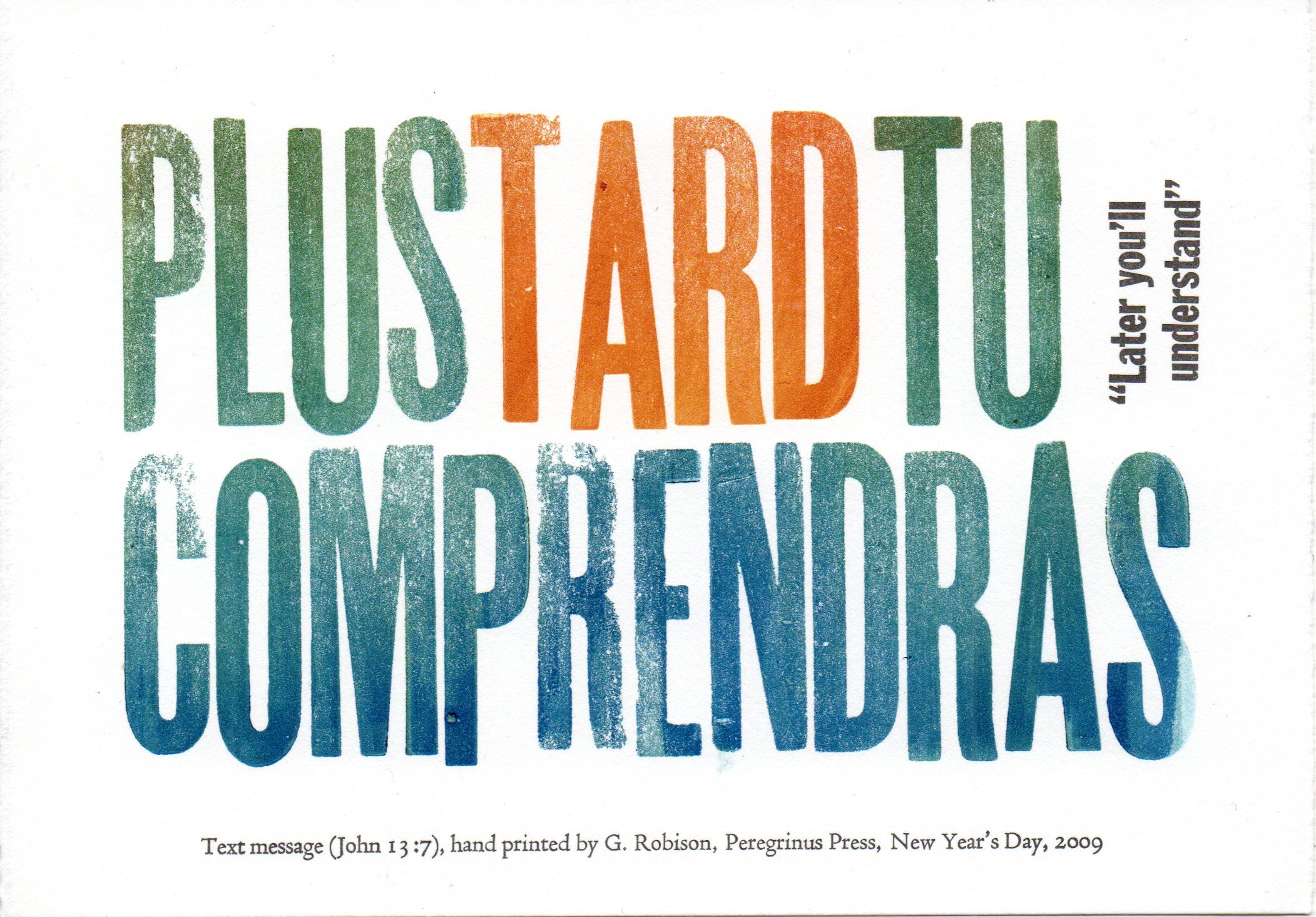
This 5x7 "text message" involved hand-inking the wood type and deliberately locking the form such that the lines are "bumpy" and uneven.

I love to use letterpress to add some class or formality where it isn't expected. At the end of every semester I give my Georgetown students a "diploma" for completing the course. It's set in Hadriano, a face designed by the prolific and esteemed American type designer Frederic Goudy in 1918 (and is the same type face used on my Yale diploma!).
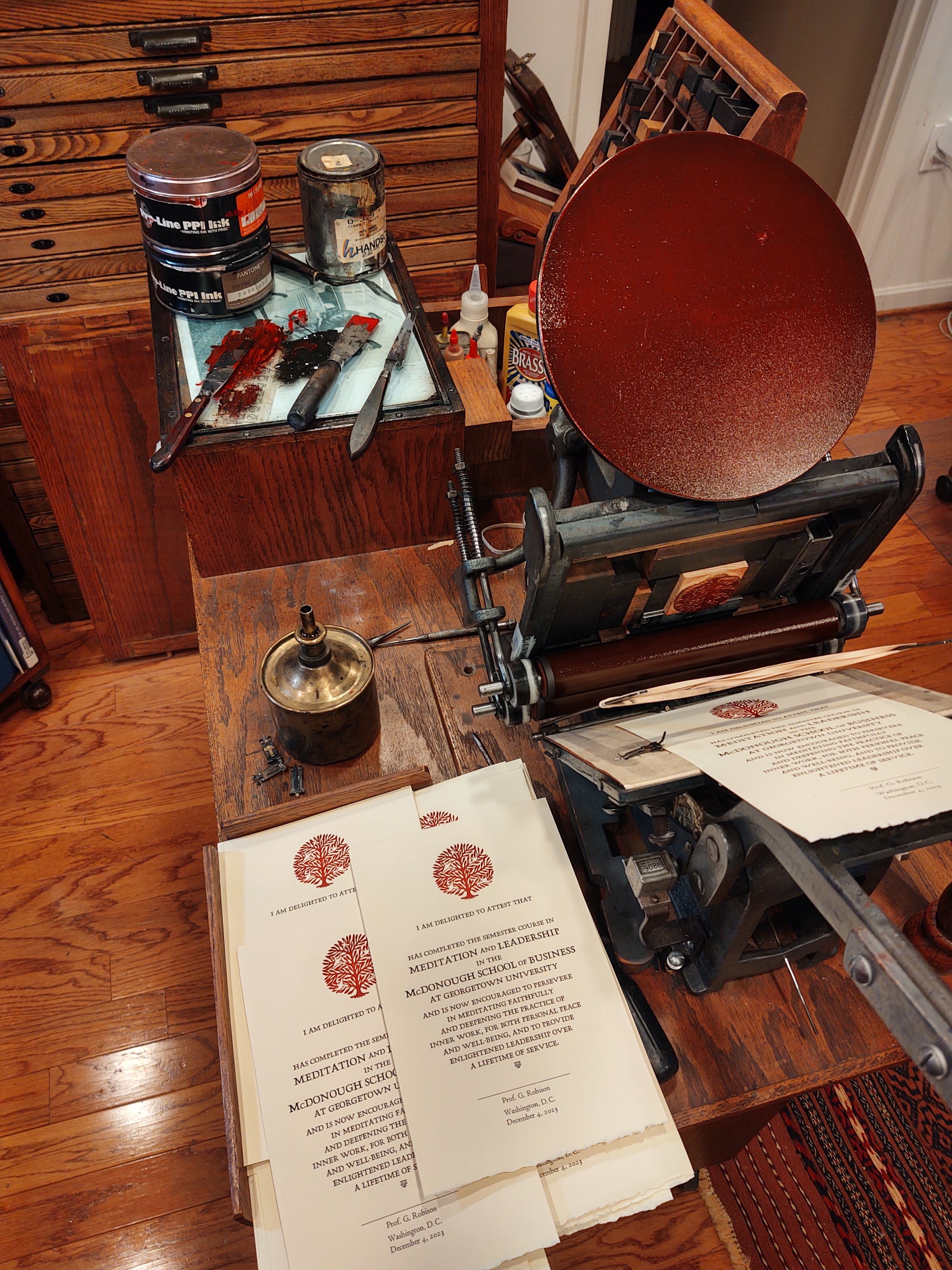
The copper cut of the "tree of life" on the "diploma" was from a drawing I made of a piece of steel folk art I saw at the John Main Center for Meditation and Inter-religious Dialogue at Georgetown University (the "JMC"). I toned down the red ink by adding some black, as you can see in the background. The earlier run through the press for the black type was done on a larger press in the studio (not shown).
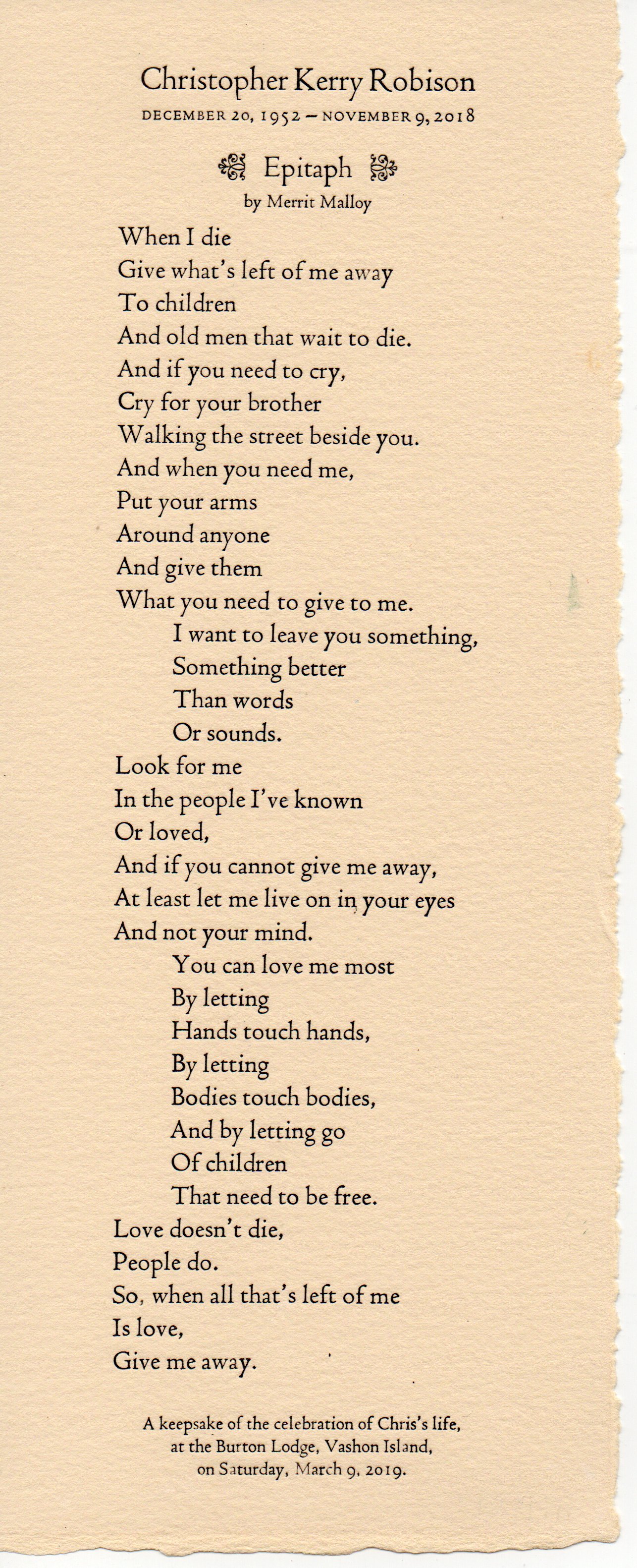
I was happy to be able to produce a keepsake for my brother Chris's memorial service, featuring a text selected by my sister-in-law Amy and set by me entirely in Bruce Rogers's Centaur — 18 pt, 14 pt, and 10 pt. Printed on heavy French paper trimmed to 4x10 inches and backed by a bristol board stiffener all enclosed in a tight-fitting plastic sleeve, it allowed attendees to take home a memento of the occasion, and was a contemplative activity for me to make it.
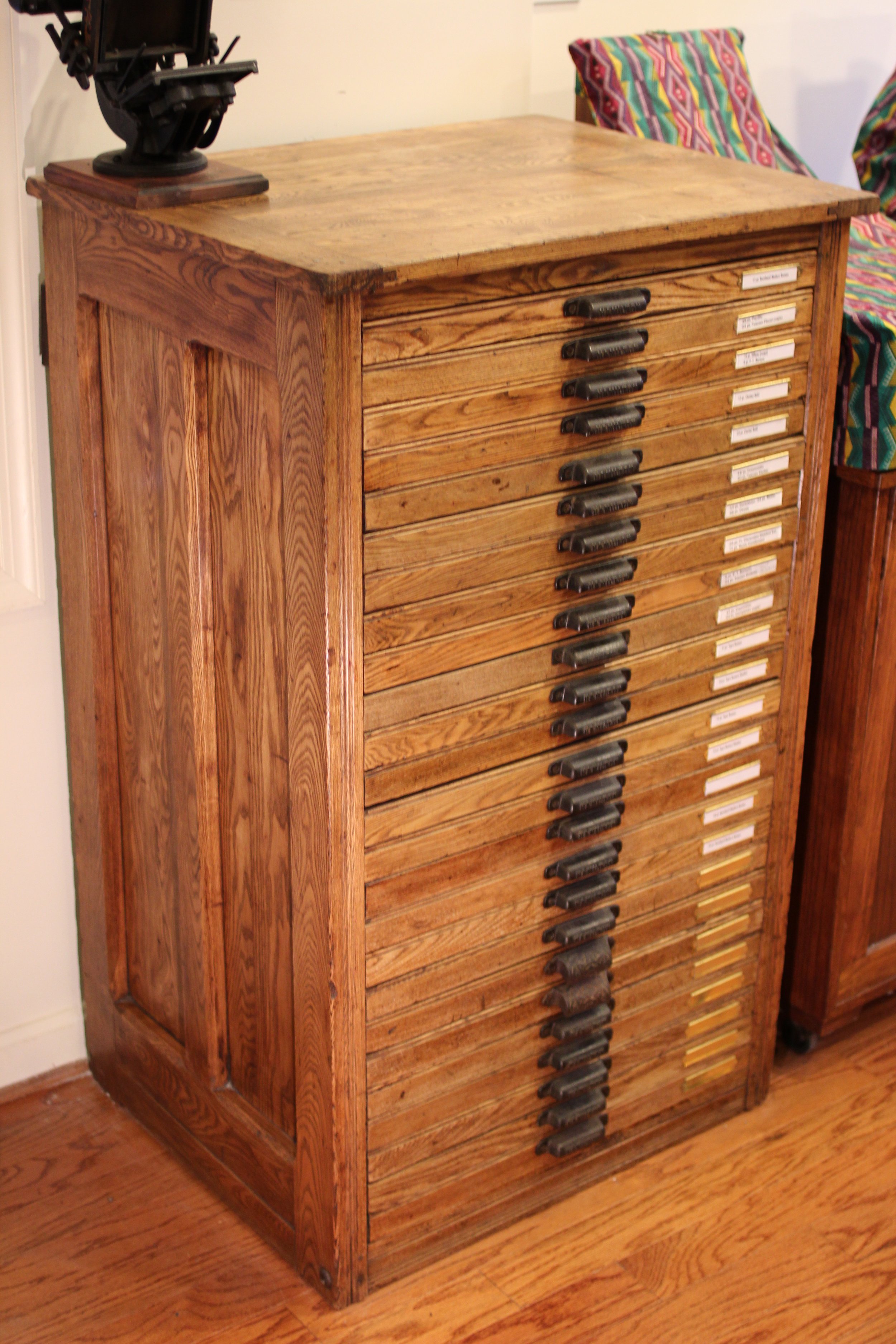
One of two two-thirds size type cabinets in my studio. Probably dating from the late nineteenth century when such cabinets were typically made of chestnut, a species that was wiped out for commercial purposes by chestnut blight (caused by Cryphonectria parasitica) around the turn of the century.

Here's the other two-third sized type cabinet in my studio. This, like the other one, was practically black with soot and dirt when I acquired it. I stripped it and waxed it to highlight the warmth of the original wood. To the left: a metal galley cabinet for storing set type in forms.

This 5x10 piece was too large to print at one pass on my little 5x8 Kelsey press in Jerusalem, so I had to print the top half of the text, then the bottom half. I managed to get it to fit seamlessly. The calligraphy — by my friend Hassan El-Mughrabi — and engravings of my images, required another four times through the press. Hassan was also a musician whose traditional folk group used to practice, in order to escape detection by the IDF patrols, in a ruined house near our place in East Jerusalem. Their lead singer was a Jewish Israeli girl who used to cross alone from the West side of town to practice with the group, until she was harassed so continuously by the soldiers (for hanging out with Arabs) that she gave up.